This was an election on the US economy. And for many Americans, the economy sucks

Unlock the White House Watch newsletter for free
Your guide to what the 2024 US election means for Washington and the world
“The US economy is strong.”
“Joe Biden is not getting credit for falling inflation and low unemployment, therefore, partisanship and media bias must be against him.”
“The US is outperforming Europe, so America’s incumbent party will do better at the polls.”
FT Alphaville spent much of this year trying to dispel these misguided and incomplete narratives:
— It’s (still) the economy (and politics) — stupid
— Why isn’t Joe Biden getting credit for America’s sturdy jobs market?
— How the ‘strong’ US economy feels for poorer Americans, in five charts
— America: a healthy or healthcare economy?
If you missed those, here’s a quick summary:
— America is continental. US GDP, unemployment and inflation data are particularly poor reflections on the economic experiences of households and businesses in different states and counties. For that, one must dig down for local and income-level statistics.
— A high-growth, high-spending economy is not necessarily a sign of a healthy economy. Many Americans are spending a high proportion of their money on rent, healthcare, and food, not discretionary items — and fuelled by debt.
— “Inflation falling, unemployment low=good” is too simplistic when people feel price-levels (cumulative inflation) and job security (opportunities and real wage growth) more palpably.
Frankly, none of this is new. Political fealty, culture wars, and disinformation may all play a part. But, for all those still unconvinced that people’s lived experience of the economy mattered as much as the exit polls and voxpops suggest, here are ten charts we’ve been monitoring all year.
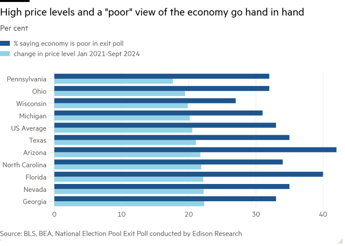
1) A 17-22 per cent rise in the price level across swing states since January 2021 has not gone unnoticed:

2) The cheapest US products have seen the fastest increase in price level; implying lower-income households have faced even higher inflation (aka cheapflation):

3) The change in price level exceeds the change in wage level across most swing states too:

4) Debt delinquencies are also rising faster than the US average in key states:

5) A reminder of how Americans spend their money on services. The bulk of household spending is going towards non-discretionary items such as rent and healthcare:

6) Some workers have had more luck in the post-pandemic labour market than others. The visible relative performance can impact how individuals feel about whether the economy is working for them:

7) Unemployment may still be low, but those on the lowest incomes have grown most worried about losing their job since the start of the year:

8) Americans of all income levels seem to be hearing downbeat news concerning government economic policies. Outsiders may see US exceptionalism on their screens, but the realities on the ground are different, and the wealthier can shoulder it better:

9) All income groups feel worse off than they did when Biden started his term, although it is more stark for the bottom and middle thirds of earners:

10) And finally. The stock market is not the real economy. America’s asset-poor see minimal upside to soaring equity and house prices:

Still don’t trust those exit polls?
#election #economy #Americans #economy #sucks


